In real estate, perception is everything—and real estate website design is where that perception is formed.
Before a potential buyer reads a single line of copy, they’ve already made a judgment based on what they see. Layout, spacing, and structure all play a role—but at the core of effective real estate website design is typography.
In 2026, the industry is doubling down on a clear truth: fonts aren’t just aesthetic—they signal value, trust, and positioning.
Here’s how typography is shaping modern real estate brands—and how to use it strategically.
The Shift: From “Nice” to Intentional
A decade ago, most real estate websites looked the same:
- Generic sans-serif fonts
- Overused templates
- Minimal brand differentiation
Today, that approach doesn’t cut it. Real estate companies are now adopting a more intentional real estate branding strategy, where typography plays a direct role in positioning.
Developers, brokers, and investment firms are now using typography to:
- Position themselves as luxury vs. mid-market
- Communicate institutional credibility
- Create memorable brand identities
Typography has become a strategic decision, not just a design choice.
The 3 Dominant Typography Styles in 2026
1. Modern Institutional (Sans-Serif Systems)
This is the look you’ll see from firms like Mast Capital, Related Group, and major developers.This approach is widely used in real estate development branding, where clarity, scale, and professionalism need to be communicated instantly.
Characteristics:
- Clean, neutral sans-serif fonts
- Generous spacing
- Minimal contrast
Common pairings:
- DM Sans + Inter
- Helvetica-style systems
What it communicates:
- Stability
- Scale
- Investment-grade professionalism
👉 Best for: developers, funds, large brokerages
2. Editorial Luxury (Serif + Sans Pairings)
Luxury real estate is increasingly borrowing from fashion and editorial design. This style has become a cornerstone of luxury real estate branding, where perception and emotional appeal drive buyer interest.
Characteristics:
- High-contrast serif headlines
- Clean sans-serif body text
- Strong hierarchy
Common pairings:
- Playfair Display + Inter
- Cormorant Garamond + Montserrat
What it communicates:
- Exclusivity
- Sophistication
- Lifestyle-driven branding
👉 Best for: high-end residential, boutique agencies, luxury listings
3. Architectural Minimal (Geometric Sans)
A growing trend, especially among design-forward developments. This style has become a cornerstone of luxury real estate branding, where perception and emotional appeal drive buyer interest.
Characteristics:
- Geometric sans-serif fonts
- Sharp, structured layouts
- Subtle but distinctive personality
Common pairings:
- Outfit + Source Sans 3
- Plus Jakarta Sans systems
What it communicates:
- Design awareness
- Modernity
- Precision
👉 Best for: new developments, architects, modern residential projects
Why Font Choice Matters More Than Ever
1. Buyers Are More Design-Literate
Thanks to exposure to brands like Apple, Airbnb, and high-end hospitality, users now expect:
- Clean typography
- Strong hierarchy
- Intentional design
If your typography feels outdated, your brand feels outdated. Users now expect a level of polish typically associated with luxury real estate website design, where every visual element feels intentional.
2. Typography = Trust
In real estate, trust is currency.
Fonts influence:
- Readability
- Perceived credibility
- Emotional tone
A poorly chosen font can make a $20M development feel like a template site.
3. Differentiation Is Hard—Typography Helps
Most real estate websites still rely on:
- Stock layouts
- Similar imagery
- Repetitive messaging
Typography is one of the fastest ways to:
- Stand out
- build brand recognition
- create a distinct visual identity
Typography is one of the fastest ways to elevate real estate branding, helping companies stand out in a crowded, template-driven market.
Best Practices for 2026
Keep It Simple (But Not Generic)
Use 1–2 font families max
Focus on hierarchy, not variety. These principles aren’t just design preferences—they are foundational to a strong real estate branding strategy.
Use Weight, Not More Fonts
Instead of adding fonts, use:
- Light / Regular / Medium / Bold
This creates depth without clutter.
Embrace White Space
Luxury is often communicated through:
- spacing
- restraint
- minimalism
Typography needs room to breathe.
Pair Contrast Intentionally
The strongest combinations:
- Serif (emotion) + Sans (clarity)
- Bold headlines + light body text
Avoid pairing fonts that are too similar—it looks accidental.
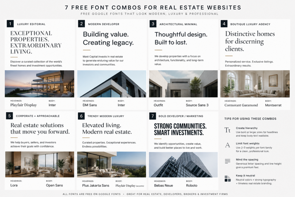
Free Font Combos That Work (2026 Edition)
If you’re building or refreshing a real estate brand, these free combinations punch above their weight:
- DM Sans + Inter → modern, institutional
- Playfair Display + Inter → luxury/editorial
- Outfit + Source Sans 3 → architectural/minimal
- Cormorant Garamond + Montserrat → boutique luxury
- Plus Jakarta Sans + Playfair Display (accent) → modern luxury hybrid
The Bottom Line
Typography is no longer a background decision—it’s a brand signal. In 2026, the most effective brands—especially in luxury real estate branding—use typography to reinforce positioning at every touchpoint.
In 2026, the most effective real estate brands:
- Use typography to position themselves strategically
- Maintain consistency across digital and print
- Prioritize clarity, restraint, and intention
At Buena Vista Creative, we approach typography the same way we approach development strategy:
every detail should reinforce value.
Thinking About a Rebrand?
Whether you’re launching a new development or repositioning an existing brand, typography plays a critical role in how your project is perceived.
If you’re ready to elevate your visual identity, we’d be happy to help. Whether you’re launching a new development or refining your real estate branding and real estate website design, typography plays a critical role in perception.